Free Narrow CPR Stock Scanner: Daily Shortlist for Breakout Trades
Narrow CPR · Stock Scanner
There are no items in your cart
Add More
Add More
| Item Details | Price | ||
|---|---|---|---|
Most traders know "above 70 is overbought, below 30 is oversold." Very few know why RSI stays overbought for weeks in a strong bull run, or how to spot a divergence before the price actually turns.
Anil Hanegave
Founder, Trading Direction · 21,000+ students trained
RSI (Relative Strength Index) is a 0-100 momentum oscillator that flags overbought conditions above 70 and oversold conditions below 30. It works best in range-bound markets and as an early warning tool through divergence, but in a strongly trending market it can stay overbought or oversold for extended periods, so a raw 70/30 crossover should never be used as a standalone entry or exit signal.
Relative Strength Index (RSI) is a technical indicator that measures the speed and magnitude of a security's recent price changes on a scale of zero to 100, used to evaluate overbought and oversold conditions.
Open any trader's chart and there is a good chance RSI is sitting at the bottom, wiggling between two flat lines. Most beginners glance at it, see "68" or "34," and move on without really using it. The problem isn't the indicator — it's that RSI gets taught as a single rule ("buy below 30, sell above 70") when it was actually built to answer a more specific question: is the recent move overextended relative to its own history?
Once you start reading RSI that way, it becomes far more useful — not as a signal that fires on its own, but as a lens that tells you when price is stretched, when momentum is quietly fading before the candles show it, and when a "cheap" stock is actually still falling for a good reason. If you're still getting comfortable with the basics of the market itself, our beginner's roadmap to trading in India is a good place to start before layering indicators like RSI on top.
This video walks through the same overbought, oversold and divergence readings covered below, applied directly on a live Nifty chart.
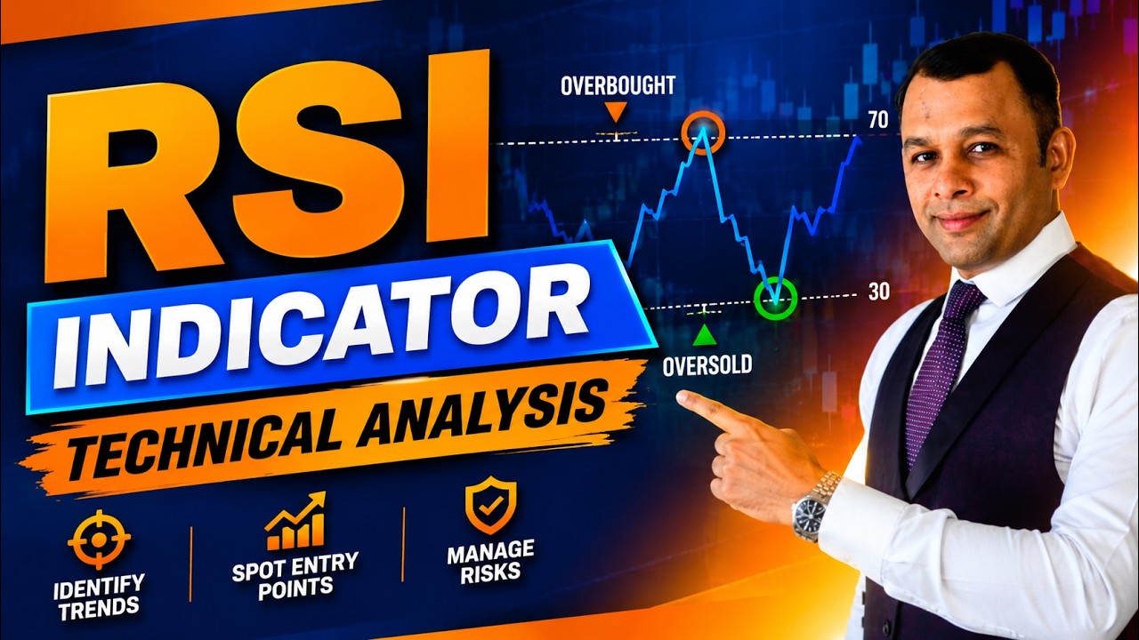
RSI is an indicator that measures the speed and magnitude of a security's recent price changes to evaluate overbought and undervalued conditions. It is displayed as an oscillator on a scale of zero to 100, plotted directly below the price chart.
It can act as a lead indicator — identifying securities that may be poised for a reversal or a corrective pullback before that shows up clearly in price. This is exactly why RSI performs best in a market that is genuinely in a trading range, moving between a support and a resistance zone rather than trending hard in one direction.
You don't need to calculate RSI by hand — every charting platform plots it automatically — but understanding the logic makes the signals easier to trust.
The exact formula matters less than this: RSI is always relative to the stock's own recent behaviour, not to the market or to other stocks. A 14-period RSI of 65 simply means recent gains have clearly outweighed recent losses over the last 14 candles — nothing more, nothing less.
A stock is usually considered overbought when RSI moves above 70, and oversold when it falls below 30. Between those two lines sits the zone most charts spend most of their time in — and that middle zone is where a lot of beginners stop paying attention, which is a mistake, because the slope of RSI through the middle often tells you about momentum shifting well before a breakout or breakdown.
Illustrative RSI scale — the 30 and 70 lines are guides, not hard rules, and shift with the dominant trend.
In a bull market, RSI will rarely fall below the 44-45 zone, even on a healthy pullback. In a bear market, RSI will rarely rise above the 50-55 zone, even on a strong relief rally. If you're watching Nifty in an uptrend and RSI dips to 46 and holds, that is often the market resting, not reversing.
Yahan problem strategy ki nahi, samajh ki hai — the problem isn't the indicator, it's applying the same 30/70 thresholds regardless of what kind of market you're in. RSI floors and ceilings shift with the dominant trend:
| Market condition | Typical RSI floor | Typical RSI ceiling | What it means for you |
|---|---|---|---|
| Strong bull market | Rarely below 44-45 | Can stay above 70 for weeks | Treat a dip to 45-50 as a pullback, not a reversal signal |
| Strong bear market | Can stay below 30 for weeks | Rarely above 50-55 | Treat a bounce to 50-55 as a relief rally, not a trend change |
| Range-bound / sideways | Bounces off 30-35 | Rejects near 65-70 | This is where classic 30/70 signals work best |
This is where most beginners go wrong. The RSI can remain overbought — 70 and above — for a long period of time in a strongly trending bull market, and it can similarly stay oversold — 30 and below — for a long period of time in an extremely bearish market. A trader who shorts the first RSI reading above 70 in a strong Nifty rally is often fighting the trend, not trading it.
A common pattern I have seen while working with traders: they treat "overbought" as a synonym for "sell now." Overbought means momentum has been strongly positive recently — it does not mean the move is finished. Momentum can stay strong for a long time in a genuine trend. RSI tells you the state of momentum, not the calendar date on which it will change.
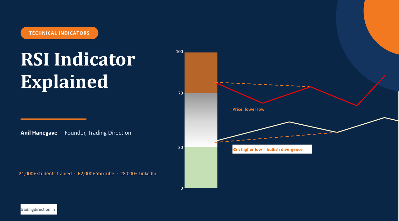
In an oversold market, if the stock makes a new low while RSI does not make a corresponding new low, that is a bullish divergence. It is an early buy signal — price is still falling, but the underlying momentum pushing it down is weakening.
Price prints a lower low while RSI prints a higher low — momentum is fading even though price hasn't turned yet.
Now look at what this looks like on a real chart. Price grinds to a new low, and everyone watching only the candles assumes the downtrend is intact. But the RSI panel below is quietly making a higher low. That gap between what price is doing and what momentum is doing is the divergence — it doesn't mean buy immediately, it means start watching for a confirmation candle or a break of the recent swing high before acting.
In an overbought market, if the stock makes a new high while RSI does not make a corresponding new high, that is a bearish divergence. It is an early sell signal — price is still pushing up, but the buying momentum behind that push is weaker than the previous rally.
Everything so far has been about reading RSI in the middle of a live session. Zoom the same indicator out to a weekly or monthly chart and it stops behaving like a fast-twitch intraday tool and starts behaving like a genuine positional filter. Here is the logic, point by point.
The same RSI indicator on a weekly NIFTY chart, alongside volume and MACD. On this timeframe RSI stops reacting to a single day's move and starts reflecting weeks of accumulated buying or selling pressure.
On a weekly or monthly chart, RSI isn't reacting to today's news or an intraday spike — it reflects weeks or months of accumulated buying and selling pressure. When weekly RSI holds above the 50-55 zone for NIFTY or a stock, that is a far stronger statement about the underlying trend than anything a 15-minute chart can tell you.
This is the single most useful application for a positional trader. In a genuine uptrend, weekly RSI rarely closes below the 40-45 zone even during a sharp correction. So if you're holding a position and the stock falls 8-10%, instead of reacting to price alone, check whether weekly RSI has actually broken its trend-holding floor, or whether it's simply dipping into the 45-50 zone and holding. The first is a real warning. The second is a normal pullback you can sit through.
A bearish divergence on a 5-minute chart resolves in an hour and means very little. The same divergence on a weekly chart — price making a new high while weekly RSI fails to confirm it — is often the first visible sign of distribution, playing out over the following weeks rather than minutes. For a positional holder, that's real lead time: enough to trim the position or tighten a trailing stop before price actually breaks down.
For investment-style buying, monthly RSI dropping into the 25-35 zone on a fundamentally sound business — during a broad market correction, not company-specific bad news — has historically marked attractive multi-year entry zones. Here RSI isn't a timing trigger, it's a gauge of how stretched the stock is on the downside, used alongside your fundamental filters, not instead of them.
When weekly RSI crosses and sustains above 50 after a long base or consolidation, it often lines up with the early stage of a fresh positional uptrend. Traders use this as a "the trend has turned, worth building a position" signal rather than trying to catch the exact bottom tick.
This is really the core reason to use RSI positionally. Intraday RSI can give ten signals a day, most of them wrong. Weekly RSI might give three or four meaningful readings in an entire year — but because each one is built on far more price data, it carries real weight. For positional trading and investing, where the goal is staying right on the big move rather than catching every wiggle, that trade-off is exactly what you want.
Before moving to the full case study below, try these on your own chart logic first.
Q1. Which of the following regarding RSI is most likely to be true?
Rohan Deshpande, a seasoned Nifty trader, is studying the weekly chart from December 2022 through October 2025. He is comfortable using both RSI and the MACD together and believes the right combination of the two can meaningfully improve trade timing.
Rohan is analysing how both indicators behaved through that stretch. Nifty had bottomed out around 16,900 in March 2023. From there, the index rallied strongly and delivered stellar returns through September 2024, eventually peaking out. Since then, the index has traded sideways for more than a year, with a pronounced negative bias. Rohan is now planning to combine a few chart patterns with RSI and MACD to try to catch the next genuine upside move.
Q2. Which of the following regarding RSI is most likely to be true?
Q3. Which of the following regarding RSI is not likely to be true?
There is no single "good" RSI value for every stock — RSI below 30 in a range-bound market is a classic oversold zone worth watching, but in a strong downtrend RSI can stay below 30 for weeks without marking a bottom. Combine RSI with price structure or support levels rather than acting on the number alone.
Yes. In a strongly trending bull market, RSI can remain above 70 for an extended period because momentum stays consistently positive. This is why shorting the first overbought reading in a strong trend is a common and costly mistake.
Divergence is a mismatch between price and RSI direction. A bullish divergence occurs when price makes a new low but RSI doesn't; a bearish divergence occurs when price makes a new high but RSI doesn't. Both flag weakening momentum before it's obvious on the price chart alone, though neither should be traded without confirmation.
The standard 14-period RSI is the most widely used setting and works well as a starting point on both intraday and swing timeframes. Shorter periods react faster but generate more false signals; the right choice depends on your holding period and should be tested on your own timeframe before relying on it live.
RSI performs best in a market that is genuinely range-bound. In a strongly trending market, the standard overbought/oversold thresholds become less reliable because RSI can sit at an extreme for a long stretch — divergence and the shifted bull/bear floor-ceiling levels become more useful than the raw 70/30 crossover.
RSI is bounded between 0 and 100 and is primarily used to read overbought/oversold conditions and divergence. MACD is unbounded and is primarily used to read trend direction and momentum shifts through the crossover of two moving averages. Many traders, including in the case study above, use both together rather than relying on either alone.
RSI works differently on a weekly or monthly chart than it does intraday. On higher timeframes it filters out daily noise, and its floor/ceiling behaviour helps you decide whether to hold through a correction or exit a genuine breakdown. It gives far fewer signals than on an intraday chart, but each one carries more weight — which is exactly what a positional trader or investor needs.
RSI is not a buy/sell button. It's a way of asking one specific question — is this move overextended relative to its own recent history — and the answer changes depending on whether you're in a trend or a range. Use the 70/30 zones as a starting filter, adjust your expectations for bull and bear market floors and ceilings, and treat divergence as an early warning that needs price confirmation, not a trigger on its own.
The setup tells you when a trade may be worth considering. Risk management — sizing your stop-loss correctly before you enter, not after — tells you how much that idea is allowed to cost you if RSI turns out to be early. Our Stop-Loss Calculator is a quick way to work that number out before you place the trade.
Everything above reads cleaner once you see it on an actual chart instead of a schematic. Here's RSI plotted below price on a real NIFTY chart, so you can see the two panels moving together across a live market cycle.
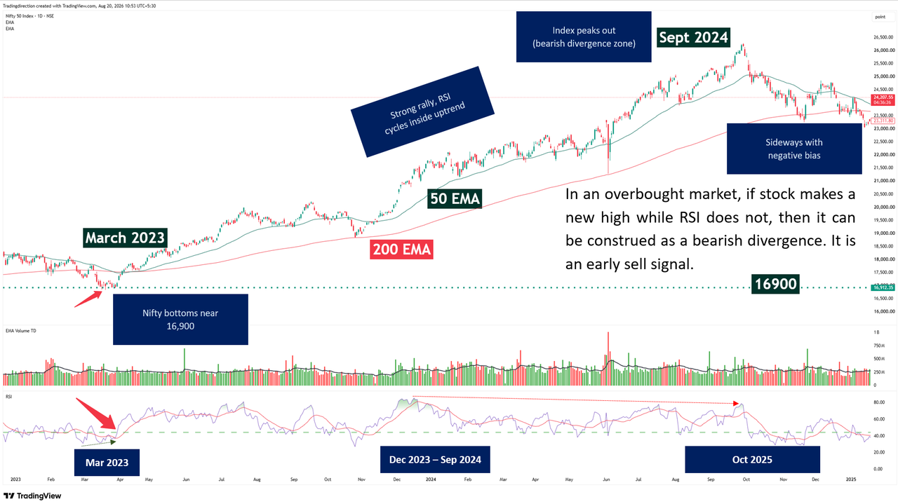
RSI plotted below price on a real NIFTY chart. Notice how the oscillator panel swings between the 30 and 70 lines while price above it moves through its own cycle of advances and pullbacks — the two panels are reading the same market from two different angles.
If you want to see how RSI, price action and CPR levels are combined live on real Nifty and Bank Nifty charts, our Sunday CPR Brahmastra webinar walks through exactly this.
Join the CPR Brahmastra WebinarFor more chart-by-chart breakdowns like this, read our guide on CPR and Pivot Point trading strategy, browse the rest of the Trading Direction blog, or check current course batches at the Trading Direction store.